

INCLUSKIN Case Study
ROLE
Web Designer & Brand Strategist
TIMELINE
6 Months
TYPE
Website Design
LIVE SITE
Project Overview:
Incluskin is a dermatology and telemedicine clinic designed to provide inclusive, accessible, and holistic skin care across a wide range of needs — including acne treatment, hair loss, hormonal health, gender-affirming care, and cosmetic services.
The platform serves users navigating complex dermatology concerns who need clear guidance, educational resources, and seamless access to virtual care and bookings. The goal of this project was to design a cohesive, user-centered digital experience that supports both discovery and decision-making in a healthcare context.
The website was positioned as a trusted entry point helping users understand services, explore educational content, and confidently engage with telemedicine tools. UX decisions focused on clarity, accessibility, and reducing friction for users seeking personalized dermatology care in a sensitive, high-trust environment.
Tools Used:
Design | Figma, FigJam
Build | Squarespace
Comms | Google Meet
Problem Statement:
Users seeking telemedicine dermatology services often encounter fragmented experiences that prioritize transactional care over holistic support. Many platforms fail to address the interconnected nature of skin health, overlooking the role of internal factors such as gut health, hormones, and lifestyle.
This creates confusion for users who need both clinical treatment and educational guidance tailored to diverse identities and concerns. Incluskin set out to address this gap by offering a comprehensive, inclusive dermatology experience that integrates medical expertise, education, and personalized care through an accessible digital platform.
Design Process:
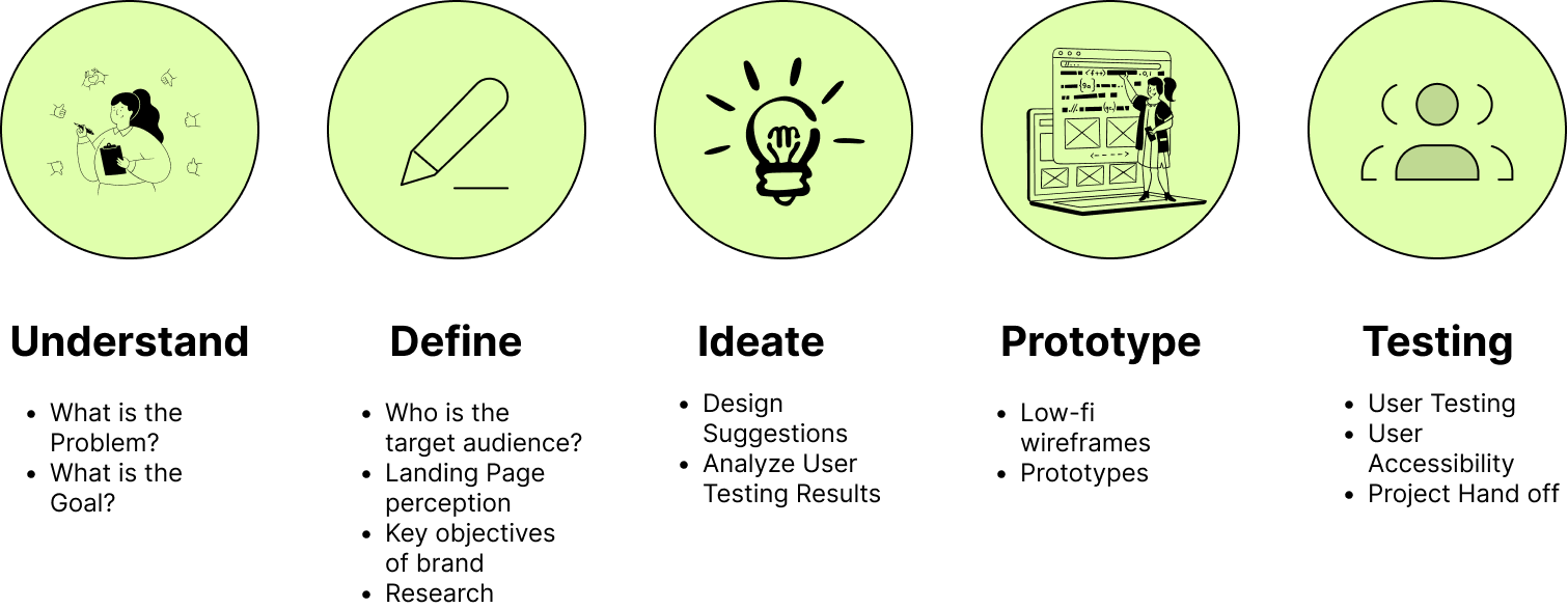
Understand :
Problem


Goal


Seamless booking experience
By providing a seamless experience for booking consultations and exploring services, users will feel included, considered, and catered before the visit.
Easy booking of all age ranges, specifically targeting younger audience engagement.
Educational resources through catered services
The goal is to create educational resources that connect skincare with overall wellness, empowering users to make informed health decisions.
Key objectives include:
Personalization: Tailor content to individual health and wellness needs.
Holistic Care: Provide resources covering both medical and cosmetic treatments.
Enhanced Accessibility: Build an intuitive, inclusive platform for users with diverse backgrounds and health conditions.
Clearly communicate business value for inclusive care
The goal is to clearly communicate the business value of inclusive, personalized care
Key objectives:
Articulate Value: Clearly present the unique benefits of inclusive care.
Showcase Inclusivity: Demonstrate how inclusive care improves patient outcomes.
Build Trust: Establish confidence in the platform’s commitment to diverse, quality care.
Encourage Engagement: Drive user interaction by showcasing the platform’s tangible benefits.
Define:
Target Audience & Brand
Incluskin serves a diverse patient base seeking dermatology and telemedicine services, including individuals navigating acne, hair loss, hormonal skin concerns, gender-affirming care, and cosmetic treatments.
Young generation including teens and young adults to early 40s and 50s
Previous patients of Nurse Practitioner Debranaye Rose
Individuals with hormonal skin concerns and lifestyle-related conditions
Patients seeking gender-affirming dermatological care
Users interested in cosmetic and holistic wellness treatments
Landing Page Perception
First impressions needed to communicate three things immediately to earn user trust and drive action:
→ Medical credibility — clinical signals, provider credentials, professional visual hierarchy
→ Inclusivity and representation — diverse imagery and affirming language
→ Ease of access to care — prominent booking CTAs, clear service pathways
Needs on Both Sides | User Intent + Platform Goals
Primary User Needs
Easily explore dermatology services and treatment options
Access educational content to better understand skin health concerns
Find answers to personal questions in a private, low-pressure environment
Feel represented and supported through inclusive language and design
Book appointments seamlessly regardless of device or technical ability
Business & Product Goals
Position Incluskin as a trusted, modern telemedicine clinic
Streamline patient pathways from education to consultation
Create a cohesive digital brand that reflects inclusivity and medical credibility
Build trust and establish confidence in the platform's commitment to diverse, quality care
Drive user interaction by showcasing the platform's tangible benefit
Ideate:
Client Direction
“Promoting dopeness and creativity — airy and flow, mauve and pastel cohesiveness, earthy warm colors.”
Design Style
Integration Needs
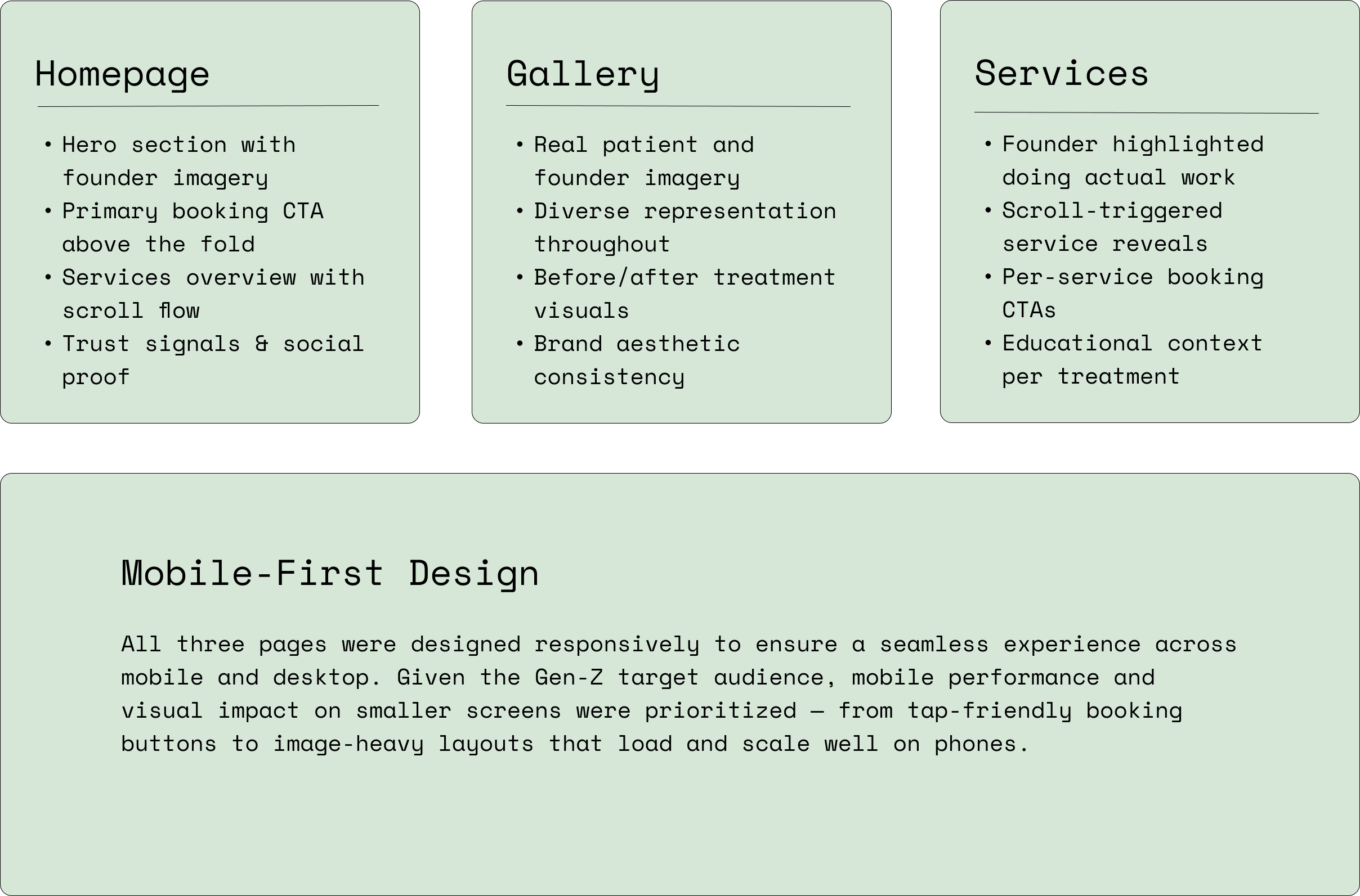
Interactive Prototyping & Responsive Design:
Two Rounds, One Major Revamp
Client feedback drove a full design overhaul. This is a rare but essential pivot that shaped the final product into something truly aligned with the brand's identity.
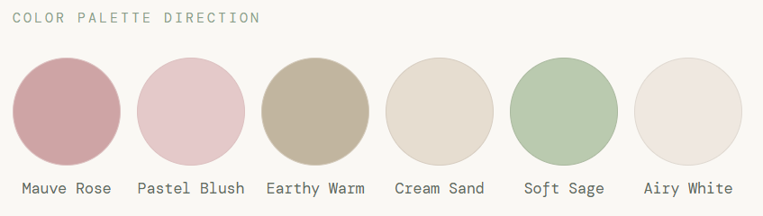
→ Minimalist & Modern. Clean layouts with intentional whitespace, nothing cluttered, nothing corporate.
→ Airy & Flow. Soft transitions, rounded forms, and generous spacing to feel light and welcoming.
→ Warm & Bright. No dark themes, brightness and warmth to feel approachable and energetic.
→ Founder-Aligned. Visual choices pulled from the founder's actual aesthetic and personalized images.
📱 Social Media Integration
💳 Payment Integration or redirection to bookings with payment information
📆 Booking & Appointment features
📸 Client Gallery including before & after work
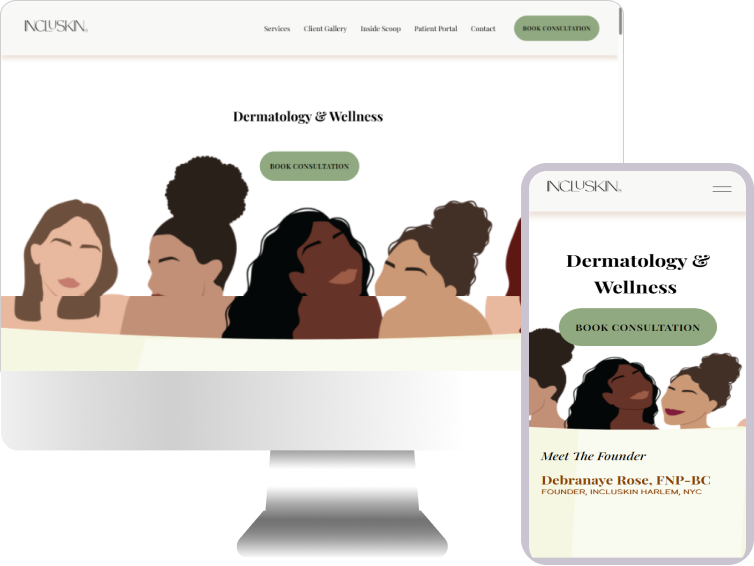
The prototype covered three core pages — Homepage, Gallery, and Services — built as an interactive, clickable flow in Figma and realized in Squarespace.
📝Designer Note
Prototype screenshots are unavailable as the interactive flows were built directly in Squarespace and iterated in-platform through client feedback rounds rather than archived in Figma. The sections below document the scope and intent of each prototype screen.
Testing:
Key Learnings: What this Project Taught Me
First Presentation
The initial design was presented to client Debranaye Rose. While functional and clean, the feedback was direct:
"Make it more youthful and cool-looking. It needs to be more derived off of my personality."
The original wasn't showcasing the founder's personality or connecting with a Gen-Z audience. A full revamp was greenlit.
Second Round Redesign
Every section was revisited and rebuilt with a fresh perspective — prioritizing personality, youth culture, and founder visibility.
🖼️Homepage Images & Layout Overhaul
Swapped out imagery and restructured the layout to feel more Gen-Z tailored; energetic, modern, and immediately engaging rather than clinically neutral.
👩🏾⚕️Founder Highlighted in Services Section
Added imagery of Debranaye Rose actively performing dermatology work as users scroll through the services section, ensuring to build trust through real visual proof of expertise.
✨Personality-Led Redesign
The entire visual tone was recalibrated to reflect the founder's creative, confident energy but a distinct, memorable identity.
Live Squarespace Delivery
Rather than a traditional Figma file handoff, the final deliverable was a fully built, live Squarespace website, handed off to the client on completion as a production-ready product.
Designing for Trust in Healthcare
Healthcare UX demands a higher standard of clarity and empathy than most digital products. Every design decision, from typography weight to CTA copy, needed to earn trust before asking users to take action. In high-stakes environments, confusion is indistinguishable from distrust.
Inclusive Design is Effective Design
Building for the most underserved users produced a better experience for everyone. The accessibility-first mindset improved usability, reduced drop-off, and created a brand identity that felt genuinely welcoming — not performatively diverse, but functionally inclusive.
Education Drives Conversion
Embedding educational content alongside service listings didn't distract users but rather, it built confidence. Users who understood their condition and options were measurably more likely to book. Informed users are engaged users.