MARIA ESCODA CASE STUDY
ROLE
Sole UX/UI Designer
TIMELINE
2 Months
TYPE
Website Redesign
LIVE SITE
Key Results:
80% increase in client visibility within 1–3 months of launch, higher consultation booking rate, and increased review submissions.
Project Overview:
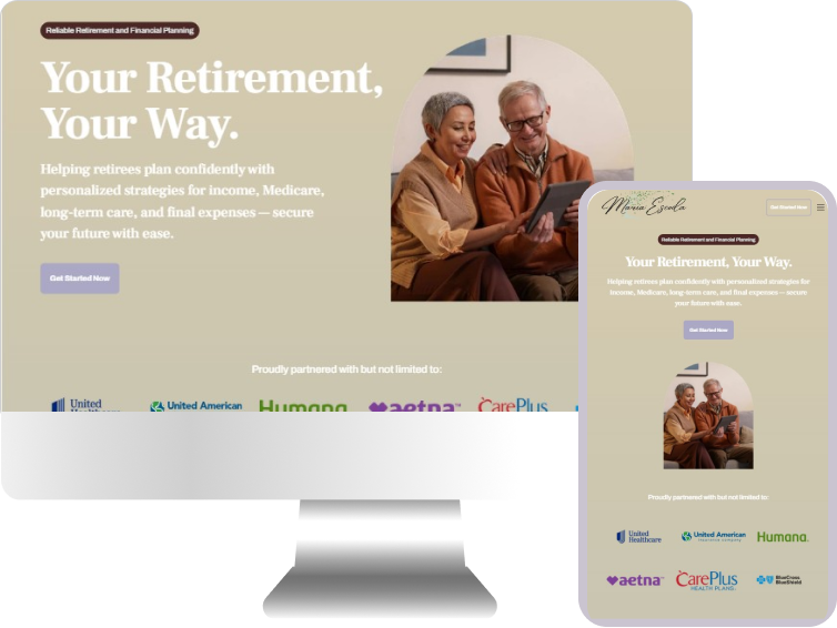
Maria Escoda specializes in Medicare and retirement and financial planning, a high-trust domain where users must quickly feel confident in the services offered and understand complex financial decisions. Her existing website struggled to support this need due to weak visual hierarchy, dense layouts, and unclear pathways to action. As the sole UX/UI designer, I led a complete website redesign over a 2 month period, prioritizing usability, scannability, and trust-building elements to better support user decision-making.
Tools Used:
Design | Figma, FigJam
Build | Framer
Comms | Google Meet
Problem Statement:
From a UX perspective, the original experience created unnecessary mental effort and friction at critical moments. Users had to sift through large volumes of information without clear guidance, which reduced clarity and weakened conversion opportunities.
Specific usability issues included:
The business impact was significant. Maria's target audience—adults ages 40-65+—already faced challenges navigating digital technology. The website's complexity compounded this barrier, preventing potential clients from successfully booking consultations through the site. Additionally, Maria lacked digital presence beyond this single website (no social media, no other online touchpoints), making the site her only opportunity to establish credibility and capture leads online.
Discovery process: I identified these issues through Maria's direct feedback about lost leads, user reports gathered through word-of-mouth from her existing clients, and usability testing with her colleagues who attempted to navigate the booking process.
What was at stake: As a service-based business entirely dependent on client acquisition, every friction point represented lost revenue. For users in the Medicare and retirement planning space, confusion doesn't just mean frustration—it means potentially missing enrollment deadlines or making uninformed financial decisions. The website needed to build trust quickly and guide users confidently toward consultation bookings.
The goal: Create a website that builds immediate trust, educates users about complex services in plain language, and provides a clear, frictionless path to booking consultations—all optimized for an older demographic with varying levels of digital literacy.
Research & Discovery
My Role & Scope
I owned the UX strategy and execution end-to-end. This included defining the site's information architecture, mapping primary user journeys, structuring content for usability, and collaborating closely with Maria to align design decisions with business objectives.
Research Methods
I conducted:
Heuristic evaluation of the existing website
Stakeholder interviews with Maria about business goals and client feedback
Competitive analysis of Medicare and retirement planning service sites
Informal usability testing with Maria's colleagues (target demographic)
Key User Insights
Research revealed that users evaluating financial services follow a predictable mental model:
Who is this?
Can I trust them?
What do they offer?
What should I do next?
Critical patterns that emerged:
Trust is the foundation
Users assess legitimacy and professionalism before engaging
Social proof (reviews, credentials) reduces hesitation at decision points
Clarity drives action
Clear visual hierarchy and visible CTAs build confidence
Progressive disclosure prevents overwhelming users in a complex service space
Journey must match intent
Homepage establishes trust first
Services provide relevant detail without overload
Contact enables action once trust is established
The redesign needed to support this natural progression, not fight against it.
Design Process
Approach
My design strategy centered on reducing friction and building trust at every touchpoint. I focused on aligning the user experience with how people actually evaluate financial services—moving from credibility assessment to service understanding to action.
Information Architecture
I restructured the site to match the user's natural decision journey:
Homepage → Establish value and trust at first touch
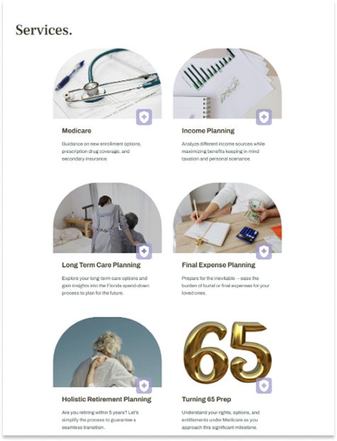
Services → Provide clarity without overwhelming detail
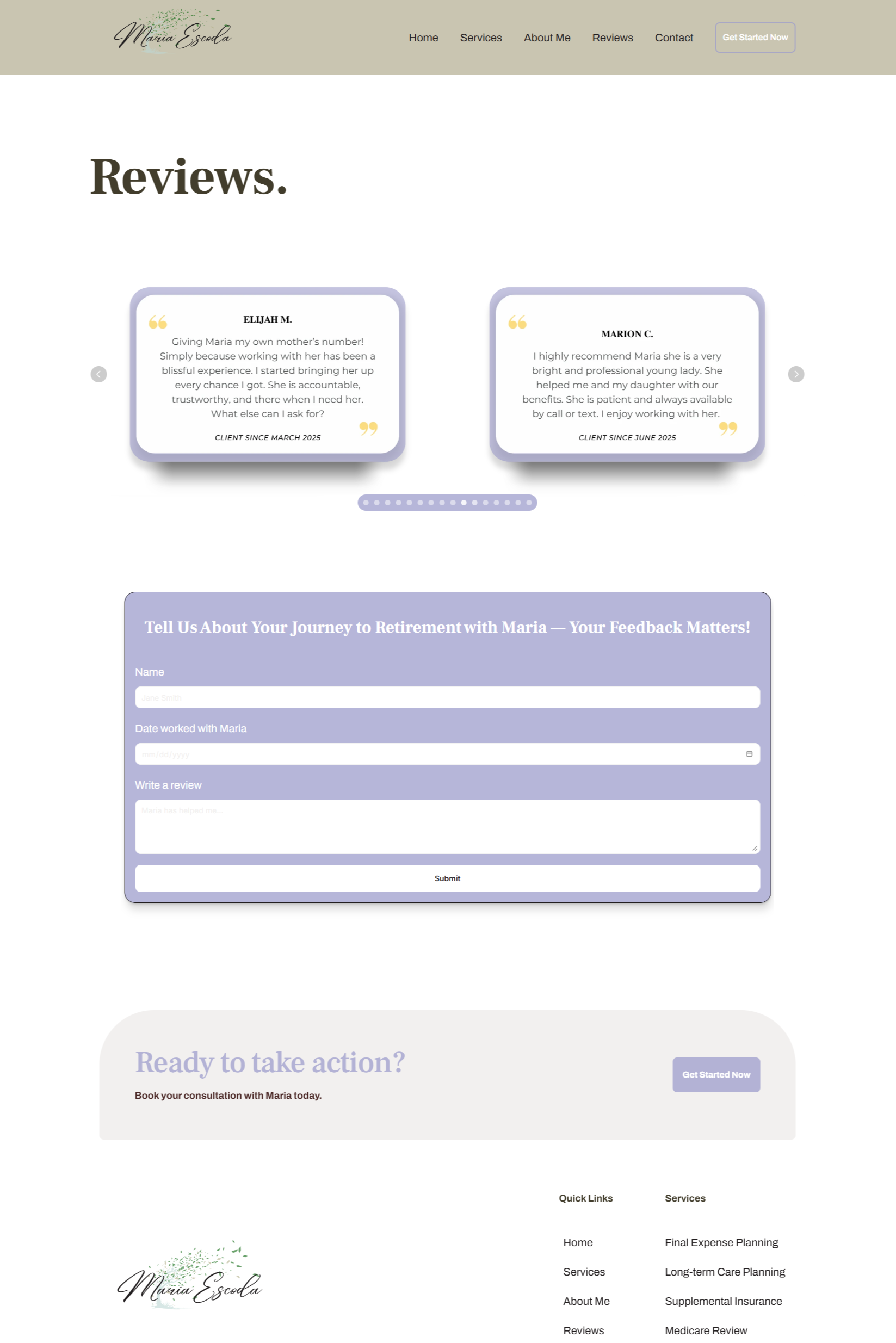
Reviews → Reinforce confidence through social proof
Contact → Enable action once trust is established
This sequence ensures users encounter trust-building elements exactly when they need them.
Key Design Solutions
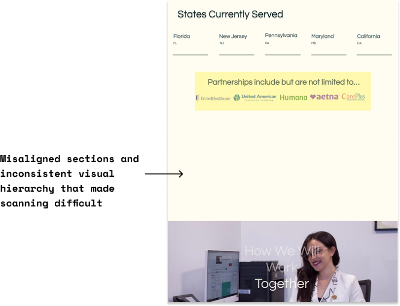
Problem: Inconsistent density and weak visual hierarchy
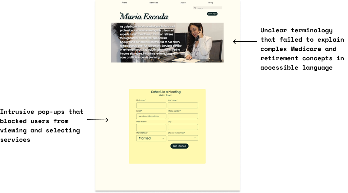
The original homepage alternated between cramped content and excessive gaps, making it unclear where to focus. Users had to work too hard to orient themselves.
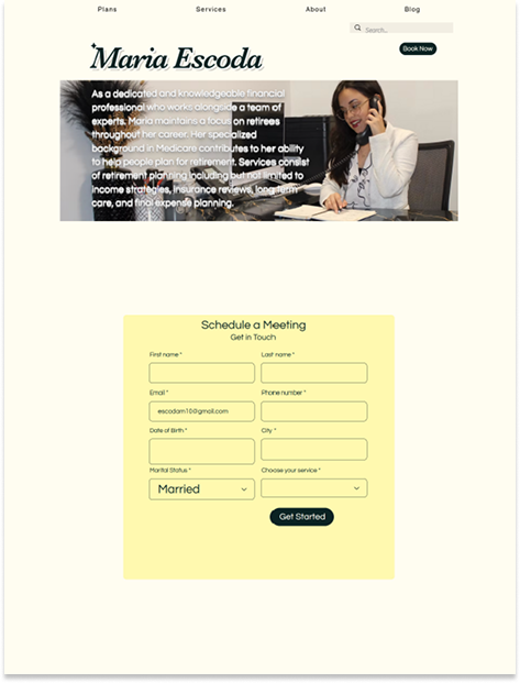
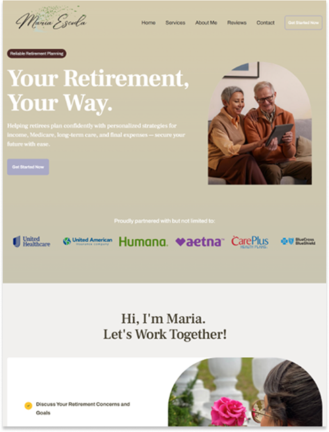
Solution: Implemented consistent vertical rhythm, strategic whitespace, and clear heading hierarchy (H1 → H2 → body) to guide eye movement and prevent information overload. Additionally, removed the hovering pop-up window to schedule a consultation and created clear CTAs.
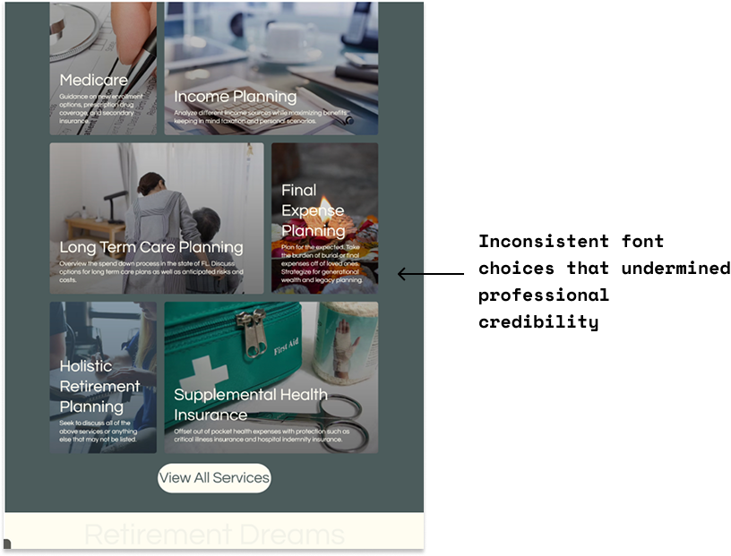
Problem: Unclear text and poor readability
Complex financial jargon combined with poor text placement made content difficult to scan—critical for users who need to quickly understand services.
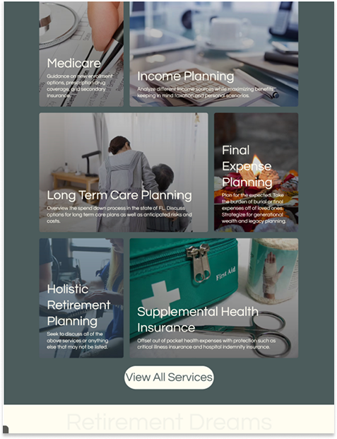
Solution: Rewrote copy in plain language, increased font sizes and contrast for the 40-65+ demographic, and used content chunking for easier scanning.
Building Trust Through Design
To establish credibility and confidence quickly, I prioritized strategic trust indicators:
Credentials and state licensing displayed prominently in the homepage hero section
Client reviews placed after service descriptions to provide social proof at decision points
Professional branding to convey expertise and legitimacy
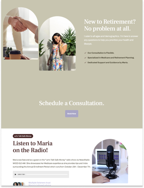
Visible contact CTAs on every page to make reaching Maria effortless
Results & Impact
Business Outcomes
Within 1-3 months of launch, Maria reported significant improvements to her business:
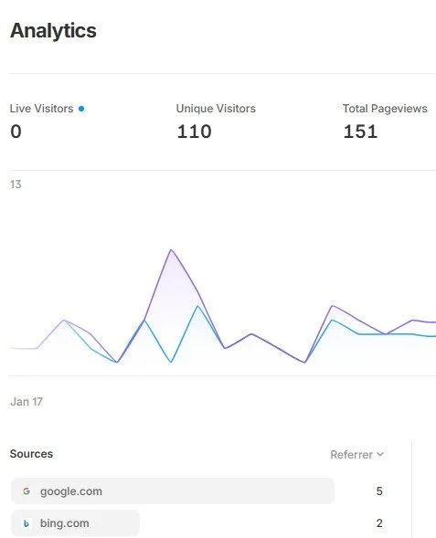
80% increase in client visibility - More prospective clients discovering her services through the redesigned site
Higher consultation booking rate - Clients were able to schedule directly through the website with less friction
Increased client review submissions - Easier navigation led to more clients leaving testimonials post-service
What I Learned
Simplicity drives action - Reducing cognitive load and friction directly impacted conversion, especially for an older demographic navigating complex financial decisions.
Trust compounds - Strategic placement of credentials, reviews, and clear contact options built confidence at every stage of the user journey.
Domain context matters - Understanding Medicare/retirement planning helped me anticipate user concerns and address them proactively in the design.
If I continued this Project
Implement conversion tracking to measure specific user paths
Add educational blog content to improve SEO and establish Maria as a thought leader
A/B test CTA messaging and placement for ongoing optimization