

Sourdough District Case Study
ROLE
Brand Strategist & UX Designer
TIMELINE
1 Month
TYPE
E-commerce Website Design & Brand Strategy
LIVE SITE
Key results:
From no brand presence to measurable digital traction in 2 months through organic growth only. No paid advertising, or boosted posts.
124
followers on Instagram within the first 2 months
4.5K
total content views between TikTok and Instagram
493
Unique website visits YTD
Editorial grid system
1.2K
accounts reached on Instagram
807
Website page views YTD
$0
Paid ad spend
01
Project Overview:
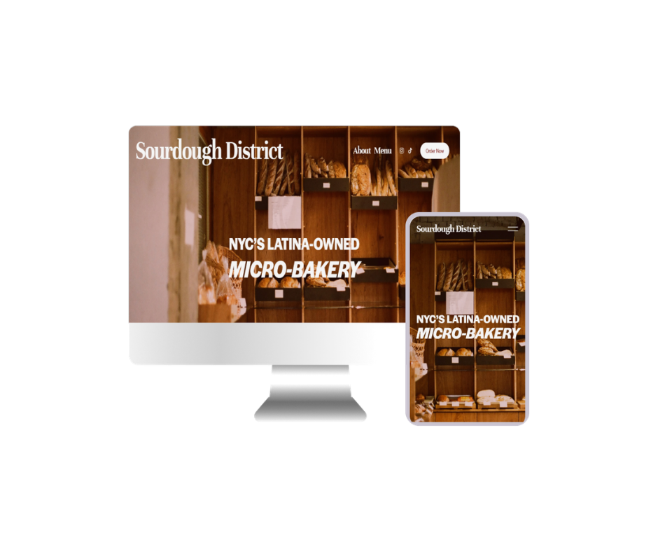
Sourdough District is a New York City micro-bakery making artisan sourdough bread from scratch. I was brought on as the founding designer and digital strategist, responsible for building the entire web presence from zero: brand identity, information architecture, Instagram presence, content system, ordering flow, and mobile-first website. The goal was creating the infrastructure needed to turn a local bakery into a discoverable, trustworthy brand. The site launched in February 2026 and became the business's primary sales channel from day one.
02
The Business Challenge
Launch an unknown NYC micro-bakery into a competitive artisan food market with zero existing audience and make the website functional, trustworthy, and converting from launch day.
03
Key Constraints
Solo baker operation with limited production capacity. Required a pre-order model (not instant checkout). No brand equity at launch.
04
Outcome
+900% month-over-month traffic growth in the first 60 days. 807 pageviews, 493 unique visitors, and a bounce rate improvement of -9% — all from a standing start with no paid advertising.
Problem Statement:
My Role & Scope
End-to-end UX and UI design, brand identity creation, Squarespace build and configuration, pre-order flow design, SEO setup, social media integration strategy, and ongoing analytics-driven iteration.
Brand Identity — Visual Language:
Playfair Display — display type
Brand audit & competitive analysis
I reviewed artisan food brands on Instagram to map visual patterns, identified white space, and defined brand positioning (warm editorial — not cold minimal, not cluttered rustic). Through competitive analysis, I also examined New York Bakeries and how they tailor to their clientele to position this NYC micro-bakery further while still holding to its roots in Latin culture.
Identity system design
Defined color palette, typography pairing, and brand voice. Created a visual identity rooted in the texture and warmth of artisan sourdough bread — editorial in feel, tactile in reference.
Instagram content system
Built a full grid system with 4 content pillars, Canva template briefs for reusable post formats, a caption voice guide, and a monthly content calendar.
Mobile-first website design
Designed a mobile-first web presence prioritizing product discovery, brand storytelling, and order conversion. Hierarchy built for small screens first, with clean desktop scale-up.
Content production & iteration
Produced ongoing content, including video and photo editing, captions, TikTok scripts, and flavor launch posts across multiple drops (Dulce de Leche, Blueberry Lemon, Jalapeño Cheddar, Truffle District, Sundried Tomato & Basil). Iterated on content rhythm based on early engagement signals and consistently reviewed analytics to understand the highest engagement conversions.
Canva template brief kit
Reflections — What I Learned:
Sourdough District had strong product-market fit but zero brand recognition. Without a visual identity or digital presence, the bakery was invisible to new customers, relying entirely on word of mouth with no scalable discovery mechanism. Launching a direct-to-consumer food business online means fighting on multiple fronts simultaneously. The design had to address all three layers of friction users would feel before placing their first pre-order.
🤝Trust Without a Track Record
Customers were being asked to pre-order bread from someone they'd never heard of. No reviews, no press, no social proof. The design had to build credibility from scratch — through craft, story, and visual language alone.
🍞Conveying Artisan Quality Digitally
Sourdough is a sensory product — smell, texture, weight. Communicating "luxury micro-bakery" quality through a screen required deliberate visual hierarchy, warm photography direction, and typography that felt handcrafted.
📦Pre-Order Flow Clarity
Unlike standard e-commerce, pre-orders require more user education upfront. When will it arrive? How does this work? The ordering UX had to be frictionless while explaining a non-standard fulfillment model to first-time buyers.
Discovery & Strategy:
Before opening Figma, I audited the artisan food space on Instagram through competative analysis. I studied how top small-batch bakeries and food brands in the Northeast positioned themselves visually. I identified two dominant archetypes: sterile minimalism (cold, forgettable) and overcrowded rustic (warm but visually chaotic).
Sourdough District needed a third path which was warm, editorial, and intentional. A brand that looked curated without feeling corporate.
The identity was built around warmth, craft, and quiet confidence. The palette draws from artisan bread itself with editorial-forward feel. The client wanted to target luxury micro-bakery while also creating immediate category recognition and standing apart from generic bakery aesthetics.
DM Sans — body & UI
Canva template kit
Design Process:
Deliverables:
Brand palette & typography system
Instagram grid rhythm & content pillars
Mobile-first website design
Content calendar mockup
#F5F5F5
Neutral White#EAE6E1
Beige#121212
Black#740A06
Burgundy#818B7E
Sage Green6+ flavor launch content suites
TikTok scripts & IG captions
Voice guide & brand tone
First 3 months content calendars
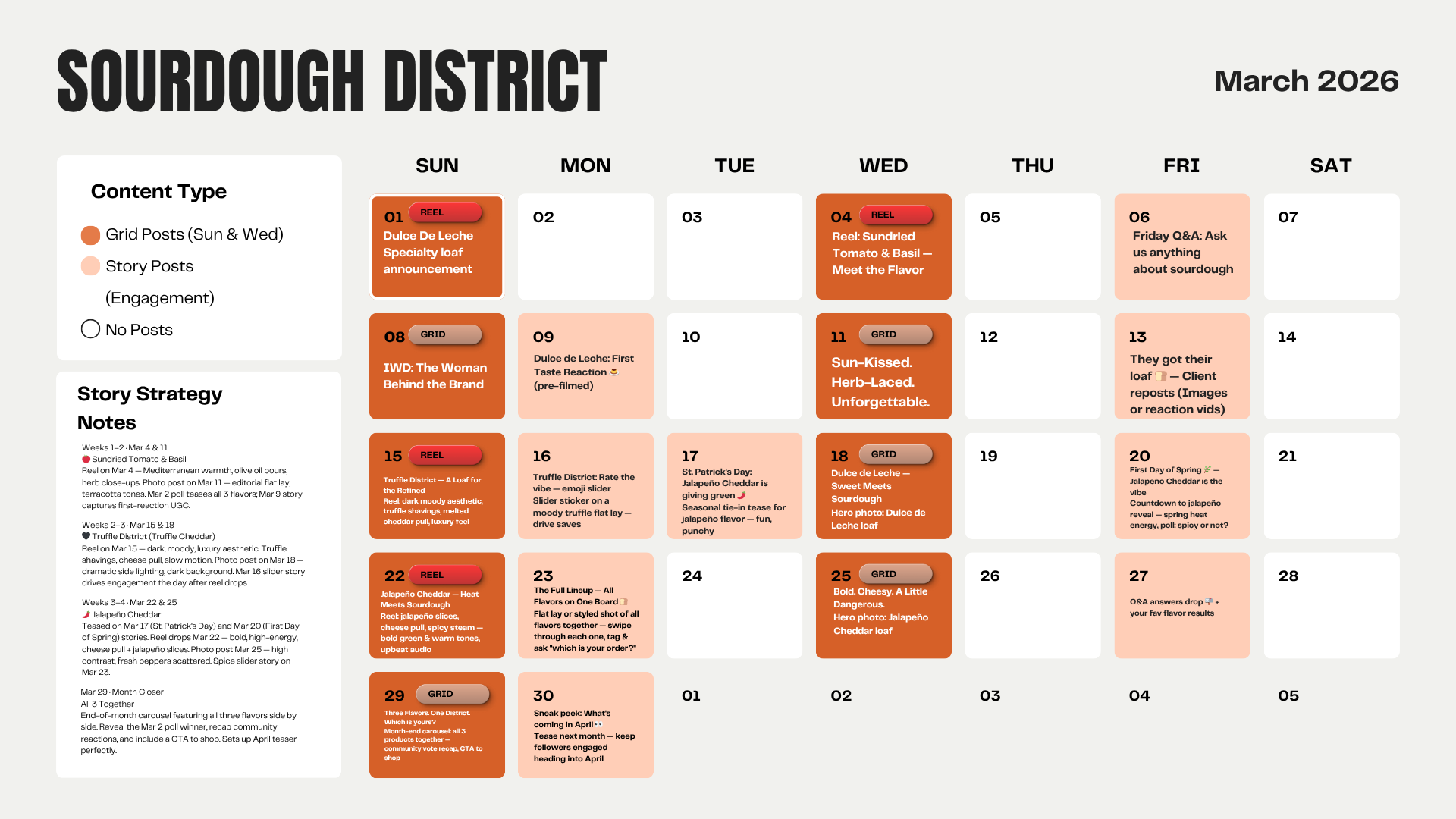
Building a brand from zero means every design decision carries more weight. There's no existing system to reference, no brand history to pull from — just a deep understanding of what the business is, what it stands for, and who it's for. That understanding became the real design tool. The clearer I got on Sourdough District's values being artisan quality, warmth, intimacy, community — the more confident every visual and content decision became.
That foundation is what made the website and social media direction feel cohesive rather than constructed. The palette, the type choices, the caption voice, the grid rhythm all traced back to the same source. I learned that when you truly understand a brand's values, the design work becomes less of isolated decisions and starts becoming one continuous conversation.
This project is still evolving — and so is the brand. As Sourdough District grows, I'm looking forward to expanding the digital presence, building out richer content systems, and eventually translating this identity into a more robust e-commerce experience. What started as a zero-to-one build is becoming something with real staying power.